Fortune Oysters
The Direction
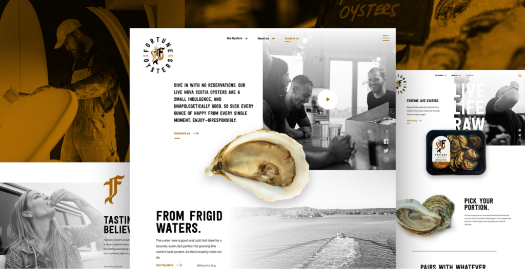
The brand’s Art Direction is based on an artistic style that’s inherently rebellious, youthful and bold-old-school tattoo art. Each element of the brand world and website embodies the spirit of this time-honoured style. Treated media like photography, video and illustrations are displayed in muted tones to add emphasis to the product and present them as the hero.
Being mindful of Fortune’s ambition to add online purchases down the road we incorporated commerce patterns that will lend themselves well to this evolution when it comes time.
The style lends itself to organizing unique layouts to house products, company information and rich media. The incorporation of small Easter eggs while scrolling or hovering (dependent on touch or desktop devices) as you navigate the website adds an element of unexpected delight when interacting with the brand online.
Audience
There are 2 sets of visitors we’re targeting with the website. Retailers looking to validate the brand, product and ensure they’re aligning themselves with the best. The other being consumers looking to find out where they can purchase and enjoy fresh oysters. While functional benefits like quality, consistency, and flavour are part of what the brand stands for, it’s the joyful experience of consuming them that matters most. We want that same experience to come across when browsing the website.
Our mission is to bring great-tasting Fortune Oysters to more people, by challenging old assumptions and welcoming a youthful audience. We aim to make Fortune products more broadly appealing and available to this audience.
View this post on Instagram
The Process
We aim to design and build every website so they’re easy to maintain on the front and backend. This website is a component-driven so the client has the ability to move blocks to change the order and presentation of their product, add new layouts and ensure longevity as the websites’ content grows over time.
The layering of media, typography, and illustrations pushed our development team to ensure consistency between breakpoints. We needed to strength test all components so we could be confident that no matter what kind of content we throw at it, Fortune can put its best foot forward.
The sites’ theme is built on WordPress and utilizes Advanced Custom Fields to ease future content growth. Subtle animations and scrolling trigger effects help reinforce the care and attention that Fortune gives to every aspect of their product from the production line to the final product in the hands of their customers.
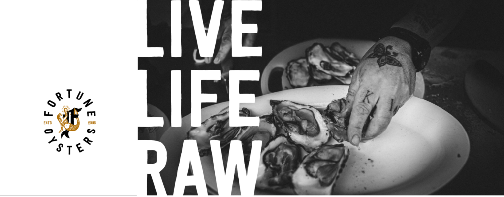
Dive in with no reservations. Fortune live Nova Scotia oysters are a small indulgence, and unapologetically good. So suck every ounce of happy from every single moment. Enjoy—irresponsibly and #LiveLifeRaw.
Project Numbers
-
GreatTasting Oysters!
-
Dozen'sSlurped
-
NoReservations
We’re super proud of this collaboration with our friends at The Northern Creative
DOSE Media

Related Case Studies
Upstreet Brewing Websites
How we designed a common website theme for Upstreet Brewing's Collective of businesses. Read more about the strategy behind our approach and execution.

Andy's East Coast Kitchen
Andy Hay was the runner-up in season 5 of CTV’s MasterChef Canada. After filming the show, Andy approached us to talk about his experience, and how we could help him with branding and building a website for him to capture this audience and position himself for long-term success.
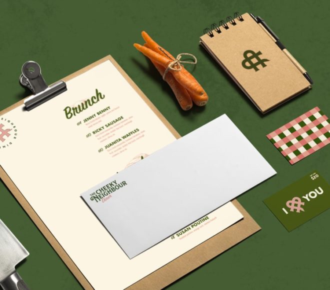
The Cheeky Neighbour Diner
Building a fun, inviting brand world, unique artwork and bright space to enjoy a twist on traditional comfort food with The Cheeky Neighbour Diner on Quinpool.
Upstreet Brewing Websites
How we designed a common website theme for Upstreet Brewing's Collective of businesses. Read more about the strategy behind our approach and execution.
Andy's East Coast Kitchen
Andy Hay was the runner-up in season 5 of CTV’s MasterChef Canada. After filming the show, Andy approached us to talk about his experience, and how we could help him with branding and building a website for him to capture this audience and position himself for long-term success.
The Cheeky Neighbour Diner
Building a fun, inviting brand world, unique artwork and bright space to enjoy a twist on traditional comfort food with The Cheeky Neighbour Diner on Quinpool.