Bowers Construction
The Ask
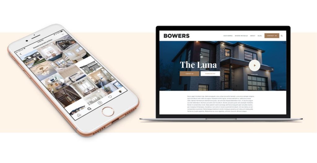
This has to be one of the biggest project flips we’ve ever done. Bowers originally came to us wanting to shoot a promo video which quickly turned into a complete overhaul of their brand from the ground up.
Bowers ConstructionMatt and Tim came into our team like the missing puzzle pieces to create the exact look and feel, web presence and brand vibe we wanted but didn’t know we needed. They slid right into our working environment so naturally, feeding off the craziness of our “family business” and turning that chaos into a real, authentic representation of who we are as a company.
The Analysis
Bowers Construction has been flat out these last five years building a name for themselves in Halifax as a local, family-run business that builds phenomenal homes. They approached Dose to do a promotional video for them, but the existing assets didn’t properly reflect their business model. It felt safe and uninspired. We laid out all of the current assets on a table and assessed the situation. We strongly felt that we could create a brand world that would better represent their core values as a company and position them as the honest, creative team they are.
Their competitors in the market have a very similar look and feel. We aimed to create something wholly unique and position them as thought leaders in the industry .
The Cure
We knew their family driven mantra was authentic from our very first meeting (we had to wrestle their 3-year-old off the Apple TV to connect our laptops for our presentation). The family chaos in the first meeting was a perfect icebreaker and great way to see what the Bowers are really about. We had great conversation and were able to derive a ton of nuggets to work within our early thinking. Our questions all seemed to lead to the same answer – Bowers wouldn’t exist without their happy home. Caleb, Suzanne and their two children are the driving force behind everything. The platform we were building had to feel organic to them and represent their different sides as a unit.
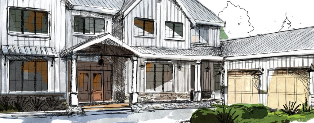
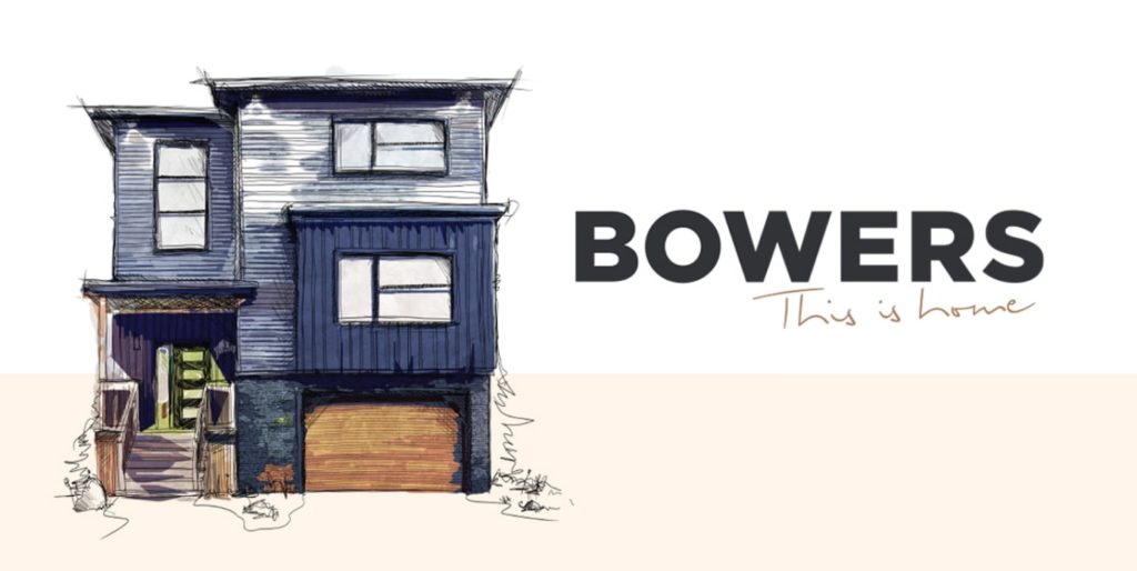
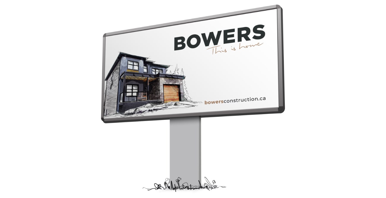
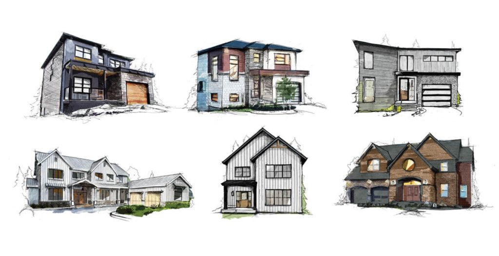
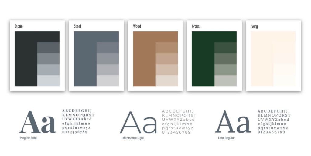
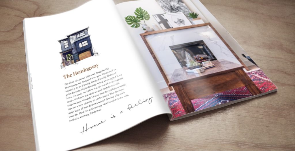
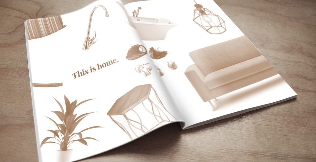
We kicked off the creative process with mood boards to help set the tone for what to expect before we executed any creative. Both of the directions we put together had plenty of flare – they chose the watercolour illustration style married with earthy tones. The choice would allow for a unique art direction in the market while also arming them with a very manageable foundation to work off through their existing social media channels.
The entire process was smooth sailing from start to finish. The result was a brand that not only represented them well on the consumer side but inspired them internally to keep their creative juices flowing. Caleb loved it so much he had the new illustrations printed on canvas and framed in his man cave. That’s a win-win!
They brought us something completely unique — and original + one of a kind is VERY important to us in a creative and competitive homebuilding field. (As these guys learned.) Not that we had to tell them, because their work was notably standout from day one. They truly understood us, but also pushed our existing content to new levels. We are so proud of our brand and believe that the work Dose has done elevated us in our industry. We are ever grateful and acknowledge our own good instincts and taste in choosing these innovators to help us soar!
Project Numbers
-
0Videos made
-
7Home illustrations
-
3Diapers changed during presentations
Caleb & Suzanne welcomed our vision and embraced a truly unique branding approach in our market
DOSE Media
Related Case Studies
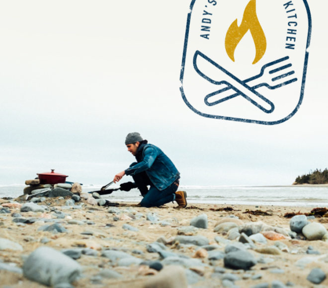
Andy's East Coast Kitchen
Andy Hay was the runner-up in season 5 of CTV’s MasterChef Canada. After filming the show, Andy approached us to talk about his experience, and how we could help him with branding and building a website for him to capture this audience and position himself for long-term success.
King's Wharf
King's Wharf needed a hand streamlining their marketing plan and tackling the launch of various business ventures and products – Dose to the rescue!

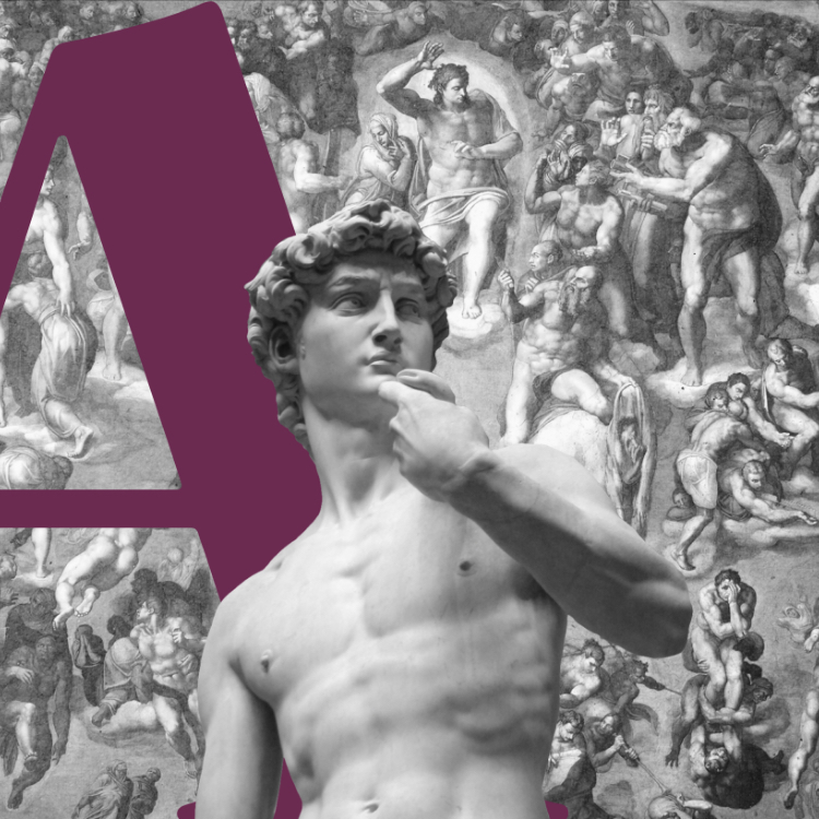
Paradigm Orthodontics
Dr. Andrew Emanuele represents a fresh face in the local orthodontist industry. He identified immediately that if his clinic was to be a success he would have to do something different to really stand out.
Andy's East Coast Kitchen
Andy Hay was the runner-up in season 5 of CTV’s MasterChef Canada. After filming the show, Andy approached us to talk about his experience, and how we could help him with branding and building a website for him to capture this audience and position himself for long-term success.
King's Wharf
King's Wharf needed a hand streamlining their marketing plan and tackling the launch of various business ventures and products – Dose to the rescue!
Paradigm Orthodontics
Dr. Andrew Emanuele represents a fresh face in the local orthodontist industry. He identified immediately that if his clinic was to be a success he would have to do something different to really stand out.